





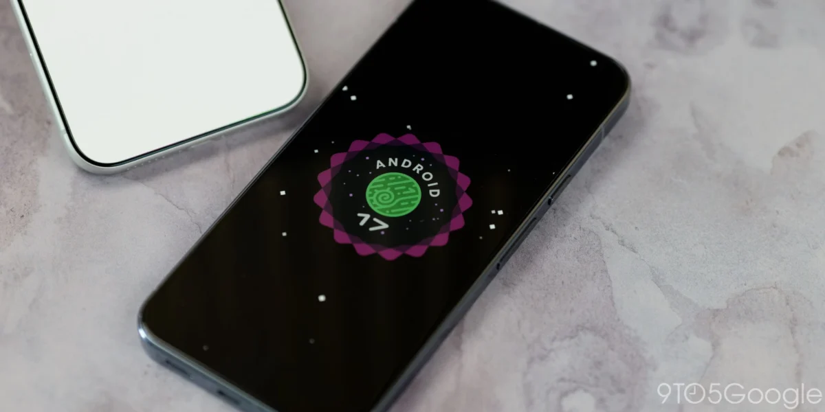
The rollout of the Android 17 QPR1 (Quarterly Platform Release) update has introduced a series of subtle yet noticeable interface adjustments to the status bar of Google Pixel devices. While these quarterly updates are typically reserved for performance optimizations, security patches, and minor feature refinements, users have observed unexpected visual modifications to system icons. These changes, which were absent during the extensive beta testing phase, have sparked a conversation regarding Google’s design consistency and the potential for unintended regressions within the Android user interface.
The Mute Icon Shift: A Design Reversion
The most prominent change observed by users following the installation of the Android 17 QPR1 update involves the status bar icon for silent or mute mode. Historically, Google transitioned from a bell icon to a crossed-out speaker icon in Android 14, a move intended to provide a more intuitive visual representation of a muted device. However, in the latest stable release, the interface has reverted to a bell icon to denote silence.
This specific modification is notable for its inconsistency. While the status bar now displays the bell icon, the volume slider interface—which users access when adjusting audio levels—continues to utilize the speaker-based iconography. This discrepancy between the top-level system indicator and the granular control menu suggests that the change may not be a deliberate design overhaul, but rather a regression introduced during the final compilation of the stable OTA (Over-the-Air) software.
VPN Icon Redesign and Visual Weight
In addition to the mute icon adjustment, users have reported a distinct modification to the Virtual Private Network (VPN) status icon. The icon, which appears in the top-right corner of the display whenever a secure tunnel is active, has been redesigned to be thicker and fully filled in.
Like the mute icon, this change was not present in any of the preceding Android 17 QPR1 Beta builds. The thicker, bolder design creates a higher visual contrast, making it more prominent in the status bar. While some users may interpret this as an effort to improve accessibility and visibility, the lack of documentation or prior testing has led to speculation within the developer community that this, too, may have been an accidental inclusion in the final release branch.
Chronology of the Android 17 Development Cycle
To understand the significance of these changes, it is necessary to examine the timeline of the Android 17 release cycle. The development process relies on a rigorous testing pipeline, where beta versions are disseminated to developers and enthusiasts to identify bugs and visual inconsistencies before the stable version is pushed to the general public.
- Android 17 Preview Phase: Initial testing focused on core architecture and foundational stability.
- Android 17 QPR1 Beta Cycle: Throughout this period, the status bar icons remained consistent with the standards established in Android 14, 15, and 16. The mute icon remained a crossed-out speaker, and the VPN icon retained its traditional outline style.
- Stable Release Week: Upon the public deployment of the Android 17 QPR1 stable build, the aforementioned changes appeared, surprising users who had been running the latest beta versions.
- Android 17 QPR2 Beta 5 Status: Interestingly, concurrent testing of the upcoming QPR2 update shows that the system has reverted to the expected speaker icon, further supporting the hypothesis that the current stable QPR1 release contains an unintended visual configuration.
Fact-Based Analysis of the Discrepancies
The discrepancy between the QPR1 stable release and the ongoing QPR2 beta cycle provides a compelling case for a technical oversight. In software engineering, "branching" is a common practice where different versions of an operating system are developed in parallel. It is plausible that an older or experimental set of icon assets was accidentally merged into the stable branch during the final build process.
From a user experience (UX) perspective, these inconsistencies can be disruptive. Google has invested heavily in "Material You" design principles, which prioritize visual harmony and user-centric customization. When status bar icons—which are among the most frequently viewed elements of the interface—change without warning or alignment across the system, it compromises the professional aesthetic that users expect from the flagship Pixel experience.
Furthermore, the status bar is a critical zone for system communication. By introducing thicker icons or changing the iconography of mute modes, Google alters the "at-a-glance" readability of the device. If the VPN icon is significantly bolder, it may distract from other essential indicators like battery level or cellular signal strength.
Broader Implications for Android Updates
The occurrence of these minor regressions raises questions about the complexity of the Android deployment process. As Google integrates more features into its quarterly releases, the risk of "configuration drift" between different development branches increases.
For the end user, these changes are minor in terms of functionality. The phone still mutes correctly, and the VPN continues to encrypt traffic. However, for a company that prides itself on design, these inconsistencies serve as a reminder of the challenges inherent in maintaining a massive, modular operating system.

It is also worth noting that the Pixel 11 series—the latest flagship hardware—is not yet eligible for this specific iteration of the update. This delay suggests that Google is taking a cautious approach to rolling out these changes to its most recent devices, potentially waiting to rectify these visual bugs before a wider deployment.
Potential Resolutions and Future Outlook
Google has not issued an official statement regarding the icon changes, which is standard procedure for minor UI adjustments that do not impact device security or core functionality. If these changes are indeed regressions, they will likely be addressed in future updates.
The most probable scenario is that a fix will be bundled into the QPR2 update, which is slated for release in December. Historically, QPR2 updates are more substantial than QPR1, often including new features and deeper system-level refinements. In the interim, users may experience a temporary period of visual inconsistency.
For those concerned about the design shifts, the situation underscores the importance of the feedback loop provided by the Android Beta program. Despite the rigorous nature of the beta testing, certain assets can be inadvertently altered at the final hour. The fact that the QPR2 beta already reflects a return to the standard speaker icon is a strong indicator that Google’s design team has recognized the issue.
Conclusion
The unexpected modifications to the mute and VPN icons in the Android 17 QPR1 stable release highlight the intricate and often fragile nature of mobile operating system development. While the changes appear to be minor visual regressions rather than strategic design shifts, they serve as a case study in the importance of version control and build consistency.
As Google moves toward the December QPR2 release, the developer and user communities will be watching closely to see if the interface returns to its expected state. For now, Pixel users are navigating a slightly altered visual landscape, one that serves as a reminder that even in the most polished software ecosystems, the path to a perfect user experience is subject to the complexities of modern engineering. Users can expect continued monitoring of these icons as the software lifecycle progresses through the final quarter of the year.