As Google’s proprietary "Liquid Glass" design language enters its second year of existence, the company has begun a significant visual overhaul of its application suite on Apple’s iOS platform. This transition marks a departure from the static, opaque UI elements that have long characterized Google’s mobile offerings, moving toward a translucent, depth-focused interface that aligns with the Material 3 Expressive design philosophy. This shift is not merely cosmetic; it represents a strategic effort by Google to harmonize its design identity across heterogeneous operating systems, ensuring that users moving between Android and iOS experience a consistent, modern visual language.
The Evolution of Liquid Glass and Material 3
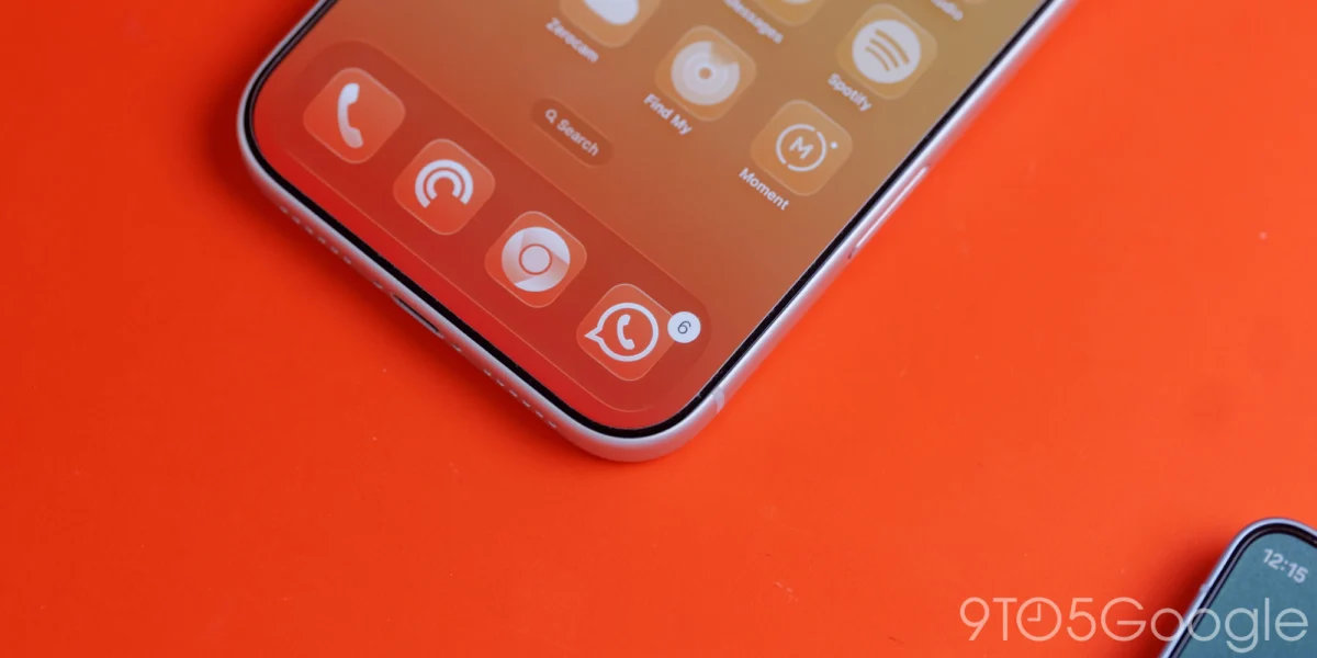
The "Liquid Glass" initiative, which debuted roughly one year ago, was designed to provide a more immersive user experience by allowing content to bleed through UI elements. By utilizing translucency, the interface acknowledges the presence of content beneath floating action buttons (FABs), navigation bars, and headers, creating a sense of layered depth.
When Google first introduced Material 3—the latest iteration of its long-running Material Design system—it focused heavily on accessibility, personalization, and high-contrast ergonomics. Material 3 Expressive, a specialized subset of this design system, emphasizes larger touch targets, playful motion, and the aforementioned translucency. By migrating these elements to iOS, Google is effectively bridging the gap between the strict design guidelines of Apple’s Human Interface Guidelines and its own internal design requirements.
Implementation in Google Photos and Google Health
The most prominent implementation of these changes is currently visible in Google Photos version 7.94. Previously, the floating bottom navigation bar in the Photos app utilized a solid, opaque background that visually severed the grid of images from the navigation controls. The update shifts this to a Liquid Glass treatment, which is highly responsive to the imagery behind it.
Users now have the option to toggle between different levels of translucency. In the "Default" setting, the bar provides a subtle, frosted-glass effect that keeps text legible while hinting at the underlying media. The "More clear" option significantly reduces the opacity of the bar, allowing the user to see the content beneath the navigation elements with much greater clarity. This feature is particularly effective in dark mode, where the default blue accent color—a hallmark of the Google ecosystem—tints the active tab indicator, creating a refined, cohesive aesthetic that complements the dark background.
![Google combines Material 3 Expressive & Liquid Glass on the iPhone [Gallery]](https://9to5google.com/wp-content/uploads/sites/4/2026/03/Liquid-Glass-dock-on-iPhone-17-Pro-Max.jpg?quality=82&strip=all&w=1600)
Beyond the Photos app, Google Health has undergone a similar transformation. The traditional navigation bar, which serves as the primary hub for health metrics and tracking, now utilizes the same frosted-glass treatment. Additionally, the "Ask Coach" floating action button has been refined with a frosted finish. This is a significant departure from the flat, solid-color buttons that dominated previous versions of the app, signaling a broader intent to standardize the "frosted" look across Google’s functional utilities.
The Phasing Out of Legacy Design Languages
The rollout of these updates confirms that Google is systematically phasing out the aging "Google Material Theme" on iOS. For years, Google apps on Apple devices were characterized by white-heavy backgrounds, thin typography, and flat surfaces. This design language served its purpose during the transition from Material Design 1 to Material Design 2, but it has increasingly looked dated compared to the sophisticated, multi-layered interfaces seen on modern iOS apps.
The transition process has been uneven, however. While core applications like Google Photos and Google Health are now receiving priority updates, other high-traffic productivity apps remain in a state of flux. Google Docs, Sheets, and Slides—often referred to as the "Google Workspace" suite—have been noticeably slower to adopt these changes, remaining largely tethered to older design conventions. Conversely, Google Tasks has seen a relatively rapid integration of these newer elements, suggesting that Google is prioritizing apps with higher daily active usage (DAU) for its design refresh.
The Challenge of Dynamic Color on iOS
One of the most persistent questions regarding Google’s design strategy on iOS is the absence of "Dynamic Color." On Android, the Material You system allows the interface to extract colors from the user’s wallpaper, automatically applying a themed palette to buttons, sliders, and navigation elements. This feature is deeply integrated into the Android framework, which provides apps with system-level access to the user’s chosen background image and color profile.
On iOS, however, Apple maintains a "walled garden" approach. Third-party applications do not have the same level of access to system-wide themes or wallpaper data. Consequently, implementing a true Dynamic Color system on iOS is functionally impossible without significant workarounds that would likely violate Apple’s App Store guidelines or result in a disjointed user experience.
Analysts suggest that Google may eventually implement a "manual" personalization system. This would allow users to select a custom accent color from a predefined palette within the Google app settings, which would then apply to all Google-branded apps on their device. While this would offer a degree of customization, it remains a secondary solution compared to the automated, wallpaper-responsive experience found on Pixel and other Android devices. Without deep system-level integration, any color-theming on iOS will likely remain static rather than dynamic.
![Google combines Material 3 Expressive & Liquid Glass on the iPhone [Gallery]](https://9to5google.com/wp-content/themes/ninetofive/dist/images/google-preferred-source-badge-dark.png)
Broader Implications for Google’s Cross-Platform Strategy
The move toward Liquid Glass on iOS carries significant implications for Google’s broader software strategy. By standardizing its design language across platforms, Google reduces the friction for users who switch between Android phones and iPads or iPhones.
Historically, Google’s iOS apps often felt like "ports" of their Android counterparts, frequently clashing with the native feel of iOS. By embracing Liquid Glass, Google is attempting to create a "middle ground." It is not trying to mimic Apple’s design language, nor is it forcing a strict Android aesthetic onto iOS users. Instead, it is building a proprietary visual identity that feels sophisticated and modern within the context of Apple’s software.
Furthermore, this design update serves as a reminder that Google’s commitment to iOS remains as strong as ever. Despite its massive investment in Android, Google derives significant revenue from its presence on the Apple App Store, and maintaining feature parity and visual quality on iOS is essential to keeping its search, cloud, and productivity services at the top of the user’s mind.
Chronology of the Design Transition
- 2021: Google introduces Material You (Material 3) alongside Android 12, focusing on Dynamic Color and personalization.
- 2023: Google begins testing the "Liquid Glass" concept, aimed at providing better depth through translucency in web and app UI.
- Early 2025: Initial signs of Material 3 Expressive appear in select Google iOS apps, though the implementation is inconsistent.
- March 2026: Google officially accelerates the integration of Liquid Glass across its primary iOS app catalog, starting with Photos and Health.
- Future Outlook: Expectations are high for the continued migration of Google Docs, Sheets, and Slides to the Material 3 Expressive standard, likely completing the transition by late 2026.
Analysis of User Impact
The transition to Liquid Glass is expected to be well-received by the broader user base. In an era of high-resolution OLED displays, the use of depth, blur, and translucency allows interfaces to feel less "heavy" and more integrated into the device’s hardware. By allowing the content—whether it be a photo in the gallery or a health chart—to influence the appearance of the navigation bars, Google is making its apps feel more "alive."
However, there are potential downsides. Increased reliance on transparency can sometimes compromise accessibility, particularly for users with visual impairments who require high-contrast interfaces. Google’s inclusion of a "More clear" toggle in the Photos app suggests that the company is aware of these accessibility challenges and is attempting to provide a level of user control that balances aesthetics with functionality.
As the tech industry moves toward more fluid, context-aware design languages, Google’s pivot to Liquid Glass on iOS is a calculated step toward maintaining its relevance in an ecosystem that it does not control. While it may never achieve the seamless system-level integration of its Android counterpart, the refinement of its UI elements ensures that Google’s applications remain competitive, professional, and visually distinct in an increasingly crowded app marketplace. The next twelve months will likely prove critical as the company works to resolve the design inconsistencies remaining in its productivity suite, signaling the final chapter of the "Material Theme" era on Apple devices.