For the better part of a century, the identity of an automobile was anchored in the simplicity of a chrome badge. An arrow, a lion, a lightning bolt, or an oval—these abstracted symbols served as the universal shorthand for brand recognition. Whether mounted on a radiator grille or trunk lid, these emblems were the definitive signature of a manufacturer. However, the contemporary automotive landscape is undergoing a significant aesthetic pivot: automakers are increasingly moving away from iconic symbols in favor of spelling out their full corporate identities in bold, deliberate typography across the bodywork of their vehicles.
This transition is far more than a fleeting stylistic whim; it represents a fundamental shift in how brands communicate with consumers in an era defined by global competition and digital presence. The lettering is no longer a peripheral detail but a core component of vehicle architecture, shaping the visual rhythm of the rear fascia and, in some instances, redefining the identity of the front end.
A Chronology of the Shift
While the current trend feels like a sudden departure, the practice of using full-name lettering has historical precedents. Porsche has famously adorned the rear of the 911 with its namesake since the mid-20th century, treating the word as a badge of honor that transcended the need for a crest. Similarly, Volvo has consistently utilized wide-spaced lettering on its tailgates, prioritizing brand legibility over an abstracted symbol.
The acceleration of this trend began in earnest during the mid-2010s, as manufacturers sought to modernize their visual identities to coincide with the rise of digital marketing. As consumers began interacting with brands primarily through high-resolution screens and social media, the need for clear, scalable, and recognizable text became paramount. By 2020, the trend had moved from luxury marques to mainstream manufacturers. Skoda, for instance, became a primary proponent of this shift, replacing its traditional winged-arrow emblem with "SKODA" lettering on the rear of its newer models, including the Kodiaq, Octavia, and the all-electric Elroq.
The Design Philosophy Behind the Text
The decision to integrate a word into the bodywork involves complex considerations of space, proportion, and lighting. Unlike a small, centralized badge, a word provides designers with a horizontal element that can be stretched to interact with taillights, light bars, or the subtle creases of the sheet metal.
In the case of the Skoda Elroq, the lettering is a pillar of the brand’s "Modern Solid" design language. The typography is designed to act as a graphic counterpoint to the vehicle’s lines, providing a sense of balance that a traditional emblem—often confined to a small, circular or oval space—cannot achieve. This approach forces designers to treat the brand name as a piece of sculpture. The spacing between letters, the stroke weight, and the font’s geometry are curated with the same level of scrutiny applied to a headlamp assembly or the contour of a wheel arch.
Lancia and DS Automobiles have adopted this philosophy to emphasize a return to premium, heritage-focused aesthetics. By treating the brand name as an integral part of the car’s rear composition, these manufacturers create a visual hierarchy where the name is the first thing a bystander notices, establishing a sense of prestige that feels more intentional than a generic, factory-stamped logo.
Supporting Data and Market Implications
The move toward full-name lettering is driven, in part, by the increasing saturation of the global automotive market. As dozens of new entrants—particularly from Asia—flood the market, the ability to achieve instant brand recognition has become a competitive necessity. According to recent automotive design studies, the "recall value" of a vehicle’s rear increases significantly when the brand name is written in clear, high-contrast lettering, compared to stylized logos that may be unfamiliar to new market segments.
Furthermore, the digital-first era demands that a brand’s visual identity remains consistent across all platforms. A logo that looks distinct on a smartphone screen might lose its impact when translated into three-dimensional physical form. By using the same typography for the car as is used on the company’s website, app, and advertising materials, brands ensure a seamless transition between the digital and physical worlds.
The Role of Illumination and Technology
Peugeot provides one of the most compelling examples of how this trend is evolving through technology. By integrating the brand name into a backlit light bar, the company has effectively transformed the badge into a functional element of the vehicle’s lighting system. This technique allows the name to be visible even at night, turning the vehicle’s identity into a luminous signature.
This technological integration suggests that typography is moving beyond mere identification. It is becoming part of the car’s lighting architecture. When a vehicle is identified by an illuminated string of letters, the distinction between the manufacturer’s logo and the vehicle’s aesthetic features becomes blurred. The word becomes the light; the light becomes the brand.
Institutional Responses and Industry Analysis
Industry experts note that this shift is not intended to render historical logos obsolete. Rather, it is a diversification of branding. Most manufacturers continue to utilize their traditional emblems on the steering wheel, hubcaps, and key fobs. The external lettering is, effectively, a "billboard" for the brand on the road.
From a manufacturing perspective, the transition requires closer coordination between graphic designers and mechanical engineers. Placing large, individually mounted letters on a curved tailgate is a significant engineering challenge, requiring precise alignment and durability testing to ensure the components remain secure in various weather conditions. Manufacturers must also consider how these letters interact with trunk latches, cameras, and sensors often located in the center of the rear fascia.
The Broader Impact on Automotive Identity
As the industry pivots toward electrification, the traditional radiator grille—once the primary location for a car’s emblem—is disappearing. Electric vehicles do not require massive cooling intakes, leading to "blank" front fascias. This change in architecture has left designers with a void, which they are increasingly filling with either elaborate light patterns or, once again, the brand’s name.
The movement toward full-name lettering represents a broader trend of simplification in design. As cars become more complex under the skin, with sophisticated sensors and autonomous driving hardware, the exterior design is moving toward cleaner, less cluttered surfaces. In this context, a simple, elegant word is often more powerful than a complex symbol.
Conclusion: A New Visual Language
The transition from the chrome emblem to the written word is a reflection of the modern consumer’s desire for clarity and the designer’s need for versatility. As vehicles become more uniform in their basic silhouettes, the details—the typography, the light signatures, the specific placement of a brand’s name—become the defining features that set one car apart from another.
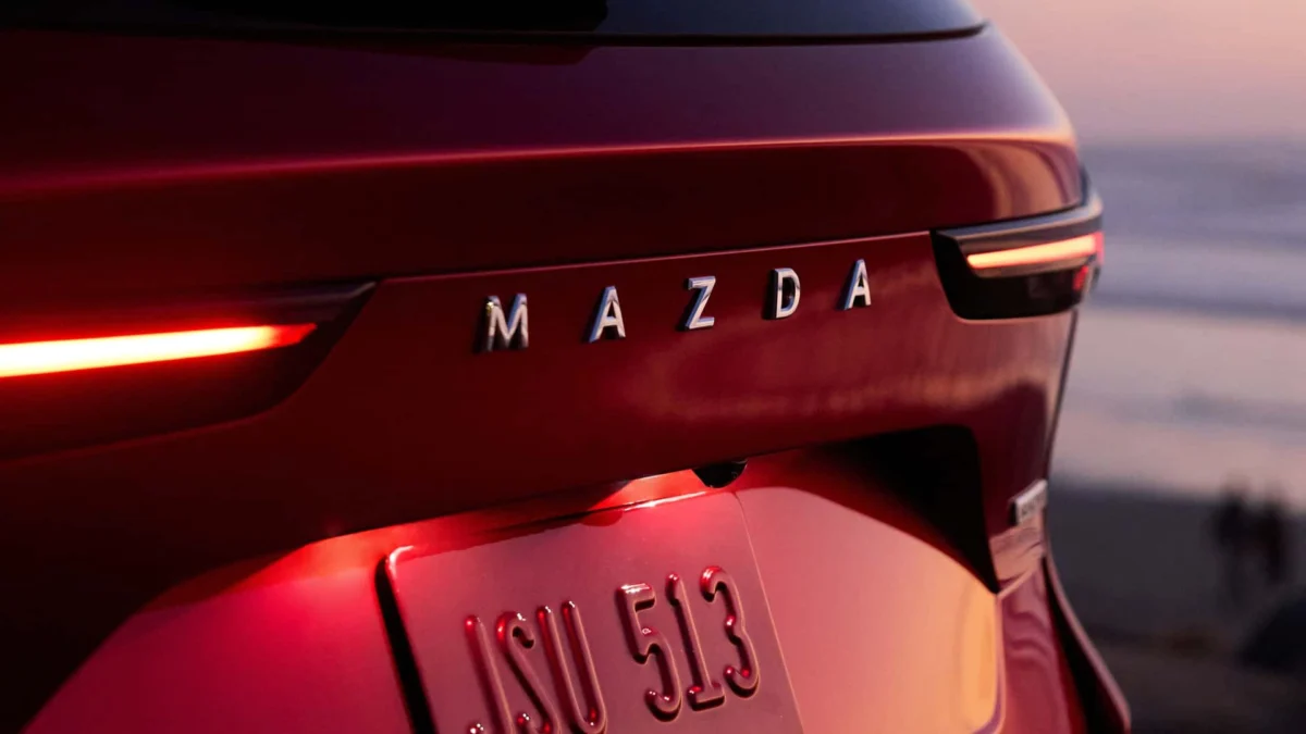
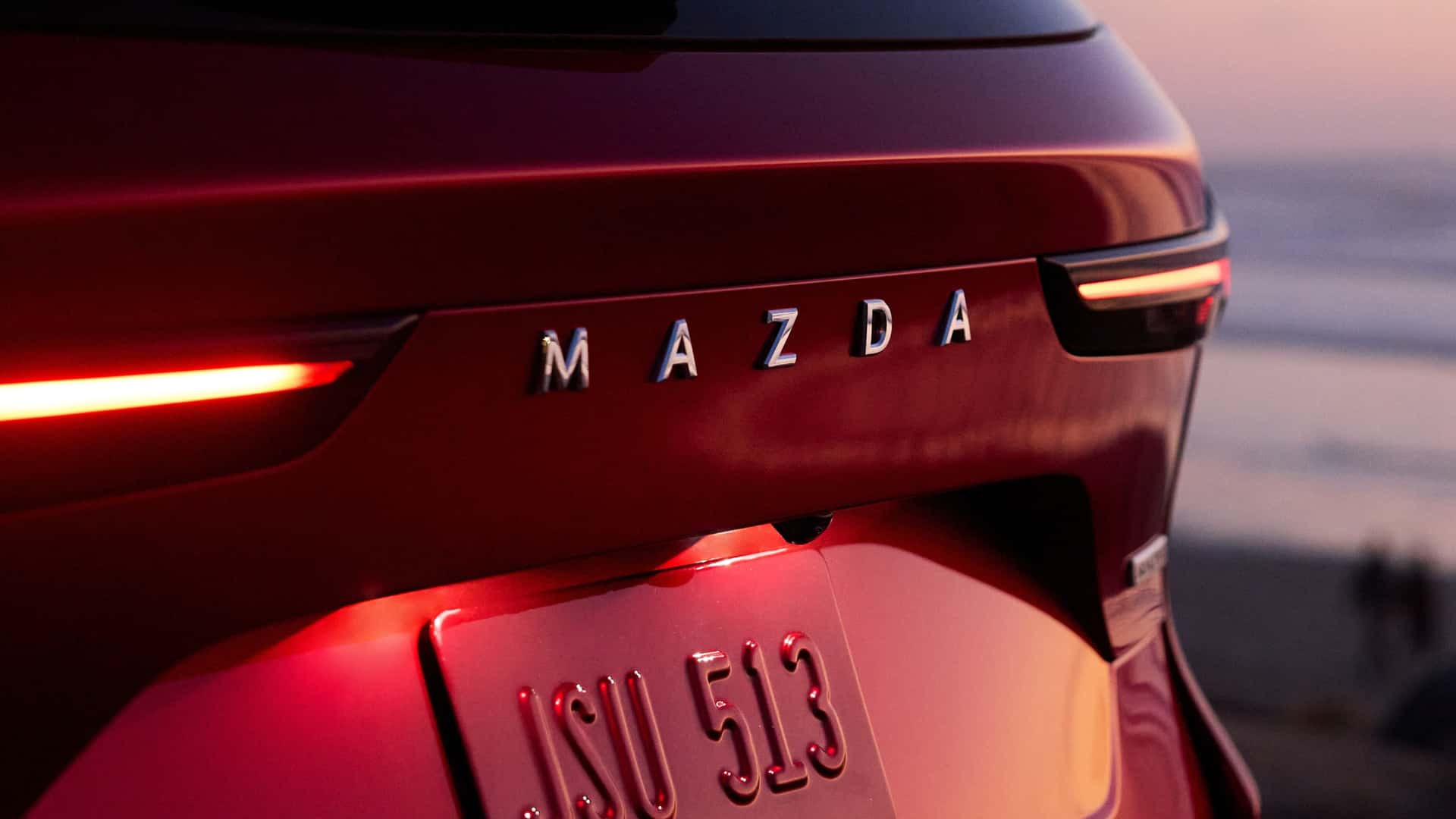
While traditional badges will likely persist as symbols of legacy and history, the future of automotive branding appears to be literal. By moving the brand name from the brochure to the bodywork, manufacturers are ensuring that their identity is not just something you see—it is something that defines the very shape and character of the machine itself. Whether through the bold, clean lines of a Mazda or the integrated, luminous letters of a Peugeot, the message is clear: the era of the word has arrived, and it is here to stay.