






The core of this update appears to be a refinement of the Material Design 3 language, emphasizing usability and ergonomic comfort. As mobile devices continue to increase in physical size, interface designers have moved toward prioritizing "bottom-heavy" UI elements that facilitate easier one-handed navigation. By shifting key functions toward the lower portion of the screen, Google is effectively aligning Messages with broader industry trends observed in other productivity and communication applications.
Evolution of the Pinned Chats Experience
The most visually distinct change in the latest beta build is the transformation of the pinned conversations section. Historically, Google Messages displayed pinned threads as standard list items at the top of the inbox, distinguished only by a small icon. The new design elevates these conversations into a dedicated horizontal carousel of circular contact avatars, positioned at the very top of the screen.
This aesthetic shift draws clear inspiration from the interface conventions found in Apple’s iMessage, which utilizes a similar top-aligned layout for pinned contacts. While the redesign creates a cleaner, more streamlined look, it introduces a functional trade-off: the lack of visible context. In the previous iteration, pinned chats retained the same metadata as standard messages, including snippets of the most recent text and timestamps. By moving to a minimalist, icon-based display, the new layout sacrifices this at-a-glance information, forcing users to open a thread to verify the status of the conversation.
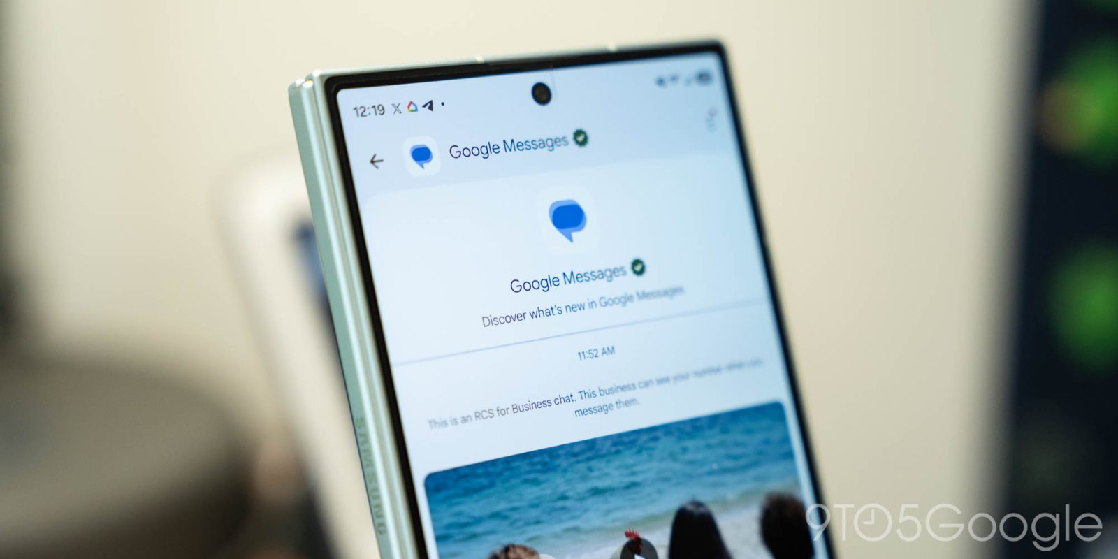
This change reflects a long-standing tension in software design between aesthetic minimalism and functional density. For power users who rely on the preview text to triage messages throughout the day, this change could represent a regression in utility. Conversely, for users managing a large volume of daily communications, the simplified visual hierarchy may reduce cognitive load, allowing them to identify frequent contacts more rapidly.
Ergonomic Adjustments and the Search FAB
Accompanying the changes to pinned chats is a fundamental restructuring of the search and "Start chat" interface. In current stable versions, these features are often relegated to a static bar or a single floating action button (FAB). The experimental design introduces a dynamic, pill-shaped FAB that resides at the bottom of the screen.
This dual-action button exhibits adaptive behavior based on user input. When the user is at the top of their message list, the button presents as a combined interface offering both search functionality and the ability to initiate a new conversation. As the user begins to scroll, the button intelligently morphs, shrinking to a compact, circular magnifying glass icon to maximize screen real estate. This implementation is a classic example of modern mobile design, where interface elements are designed to be "alive"—reacting to the user’s actions in real-time to provide the necessary utility without obstructing the view of the inbox.
The implications for one-handed usability are significant. In an era where flagship smartphones frequently exceed 6.7 inches in screen height, placing critical interaction points near the bottom of the device is essential for accessibility. By ensuring that search—a feature often buried in menus in older app architectures—is always within reach of the user’s thumb, Google is prioritizing efficiency for the majority of the Android user base.

Integration of Gemini AI
The third pillar of this redesign involves the relocation of the Gemini shortcut. Previously integrated into the interface via a dedicated FAB, the shortcut has been moved to the top-right corner of the screen, adjacent to the user’s profile icon. This move serves two strategic purposes.
First, it creates a visual consistency with Google’s broader ecosystem. The placement of the AI assistant alongside account settings and search mirrors the design language of Google Workspace applications like Docs, Drive, and Gmail. By standardizing the location of the Gemini portal across its suite of apps, Google is training users to associate that specific corner of the screen with AI-powered assistance.
Second, it clears the "noise" from the primary inbox view. Removing the Gemini FAB from the bottom of the screen allows the "Start chat" button to take center stage, emphasizing the primary purpose of the application: communication. The shift indicates that while Google views AI as a critical component of its messaging future, it is attempting to integrate that technology in a way that does not overshadow the fundamental utility of the app.
Chronology of the Redesign
The rollout of these features follows a pattern consistent with Google’s iterative development philosophy. Throughout 2026, the company has released a series of incremental updates to the Messages platform, moving from a strictly utilitarian interface toward a more feature-rich, AI-integrated hub.

- Early 2026: Google began testing deeper Gemini integration, allowing users to draft replies and summarize long threads directly within the app.
- September 2026: The company introduced a refreshed app icon, signaling a broader brand alignment effort.
- November 2026: The current beta phase commenced, introducing the three-part UI overhaul discussed here.
At this time, the features are being released in a "piecemeal" fashion. Not all beta testers have received the full suite of changes simultaneously, suggesting that Google is conducting A/B testing to measure user engagement and sentiment before committing to a stable, wide-scale rollout. This staggered approach is typical for the Google Messages team, which must balance the needs of a global user base that ranges from entry-level Android devices to high-end flagship phones.
Broader Implications and Industry Context
The redesign of Google Messages must be viewed through the lens of the intensifying competition in the messaging space. With the adoption of RCS (Rich Communication Services) as the industry standard, Google has successfully bridged the gap between Android and iOS messaging capabilities. However, as the technical gap closes, the battle has shifted to the user experience (UX).
Google’s decision to adopt a layout reminiscent of Apple’s iMessage is likely a strategic move to lower the barrier to entry for users transitioning between platforms. By creating a familiar visual language, Google reduces the "learning curve" for new users, thereby increasing retention rates.
Furthermore, the focus on AI integration reflects a broader pivot across the technology sector. By positioning Gemini as a persistent, easily accessible assistant, Google is attempting to turn the messaging app from a simple text-delivery tool into a productivity assistant capable of scheduling meetings, searching for information, and drafting content. The challenge remains whether users will embrace these AI features or if they will perceive them as intrusive to the core experience of chatting with friends and family.

Analysis of Future Outlook
As the beta testing period continues, the data gathered by Google will be instrumental in determining the final form of the application. The removal of history/last-sent information in the new pinned chats section remains the most controversial aspect of the update. It is possible that, based on user feedback, Google may implement a hybrid approach—perhaps allowing users to toggle between a "minimalist" view and a "detailed" view.
Additionally, the success of the new bottom-bar navigation will depend on the sensitivity of the scroll-to-minimize animation. If the button is too intrusive, it could lead to accidental clicks; if it is too sensitive, it could create a jarring visual experience.
In conclusion, the Google Messages homepage redesign is an ambitious project that attempts to harmonize aesthetics, accessibility, and artificial intelligence. While the move toward a cleaner, more ergonomic design is generally welcomed, the company must carefully navigate the balance between modernization and the loss of functional transparency. As the beta matures, the final product will likely serve as a benchmark for how Google envisions the future of mobile communication in an AI-first world.