The landscape of mobile interface design is currently undergoing a significant transition as Google accelerates the integration of its proprietary "Liquid Glass" design language into its suite of iOS applications. One year following the initial introduction of this aesthetic, Google has begun deploying the translucent, frosted-glass effect across key productivity and utility apps, signaling a move toward a more cohesive, platform-appropriate visual identity for its cross-platform software. This shift marks a notable departure from the previously rigid, opaque design standards that governed Google’s mobile offerings, aligning the company’s iOS presence more closely with the sophisticated translucency standards native to Apple’s iOS design guidelines.
Evolution of Design: From Material Theme to Liquid Glass
For years, Google maintained a "Material Theme" consistency that sought to unify the user experience across Android and iOS. While this strategy prioritized brand recognition, it often left iOS users feeling that Google applications were "foreign" entities that did not adhere to the depth and transparency expectations of the Apple ecosystem.
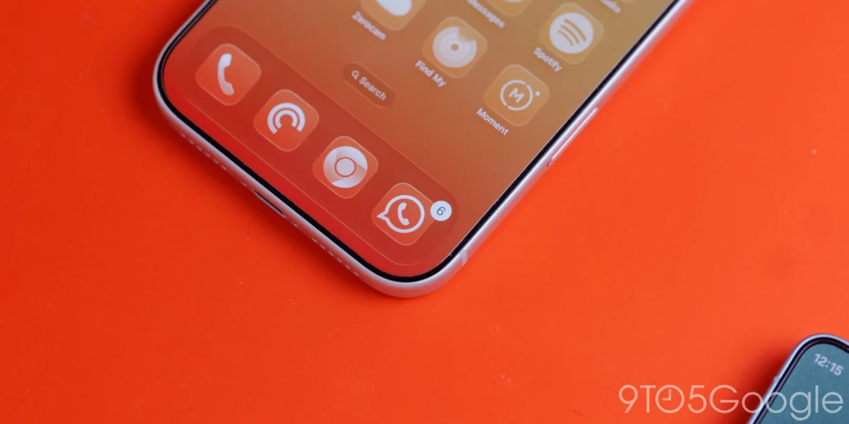
The introduction of Material 3—Google’s third iteration of its Material Design system—brought with it "Expressive" components, which allow for more dynamic and adaptive UI elements. Liquid Glass serves as the pinnacle of this expressive philosophy. By utilizing blur effects and high-fidelity translucency, Liquid Glass allows the underlying content—be it a photograph, a document, or a background gradient—to influence the color and tone of navigation bars, docks, and floating action buttons (FABs).
The current rollout, observed in version 7.94 of Google Photos, exemplifies this change. The floating bottom bar, which previously relied on a solid, non-interactive background, has been replaced with a semi-transparent layer. Users can now choose between different levels of translucency, such as a "Default" setting or a "More clear" option that prioritizes visibility of the media behind the UI elements. In dark mode, this implementation is particularly striking; the system’s accent colors bleed through the frosted layer, creating a cohesive visual harmony that feels inherently native to the iPhone’s interface.
Chronology of the Material 3 Transition
The migration of Google’s iOS apps to Material 3 has been a deliberate, multi-year process. The timeline of this transition highlights the company’s cautious approach to updating its massive portfolio:
![Google combines Material 3 Expressive & Liquid Glass on the iPhone [Gallery]](https://9to5google.com/wp-content/uploads/sites/4/2026/03/Liquid-Glass-dock-on-iPhone-17-Pro-Max.jpg?quality=82&strip=all&w=1600)
- 2021-2022: Google announces Material You and Material 3 for Android, focusing on dynamic color extraction from wallpapers.
- 2023: Google begins testing Material 3 components on iOS, focusing initially on typography and button shapes rather than advanced rendering techniques like Liquid Glass.
- March 2025: Liquid Glass is introduced as a design concept, aimed at bridging the gap between Material 3’s functional rigor and the aesthetic elegance required for high-end mobile devices.
- Late 2025 to Early 2026: Google Tasks receives a major overhaul, implementing M3 design principles.
- March 2026: The current deployment phase. Google Photos, Google Health, and other core apps begin integrating Liquid Glass, marking a turning point in how Google apps "feel" on the iPhone.
Despite this progress, the transition remains fragmented. While apps like Google Photos and Google Health are leading the charge, heavy-duty productivity applications—specifically Google Docs, Sheets, and Slides—continue to lag behind, still relying on older Material Theme components. The ongoing update cycle for Google Keep suggests that the company is prioritizing apps with higher daily usage rates for these visual enhancements.
Technical Analysis: Why Dynamic Color Remains Absent on iOS
A recurring question among tech analysts and users is why Google has not implemented "Dynamic Color" (also known as Monet) on iOS. On Android, Dynamic Color allows the entire system UI to change its palette based on the user’s wallpaper, creating a deeply personalized experience.
The primary hurdle for this feature on iOS is architectural. Apple’s operating system enforces strict sandboxing, which prevents third-party applications from accessing system-level wallpaper data in the same way Android does. Without this bridge, implementing a system-wide color extraction tool would require Google to develop a separate, manual color-picking system within each app. However, such a feature would likely feel cumbersome and redundant. Given that the core value of Dynamic Color is its "set it and forget it" nature, a manual implementation on iOS would arguably fail to provide a superior user experience, leading Google to favor the neutral, elegant aesthetic of Liquid Glass over the complex color-shifting mechanics found on Android.
Impact on User Experience and Interface Parity
The integration of Liquid Glass is not merely a cosmetic choice; it serves a functional purpose in modern UI design. Translucency creates a sense of depth, helping the user understand the spatial hierarchy of an application. By allowing content to be visible behind navigation elements, the interface feels more expansive, even on smaller screen sizes.
In the Google Health application, the implementation of Liquid Glass on the navigation bar provides a clear distinction between the primary content area and the navigation tools. The "Ask Coach" floating action button, now treated with a frosted-glass finish, stands out as an interactive element without visually obstructing the health metrics and charts beneath it. This design choice effectively reduces visual noise, allowing users to focus on their data while maintaining access to navigation.
The Role of Design Consistency in Brand Loyalty
For a company like Google, which relies on the ubiquity of its services on third-party platforms, design consistency is a critical asset. Apple users are conditioned to expect certain interactions, such as the blur effects found in the Control Center or the Safari interface. By adopting Liquid Glass, Google is effectively "speaking the language" of the iOS user.
![Google combines Material 3 Expressive & Liquid Glass on the iPhone [Gallery]](https://9to5google.com/wp-content/themes/ninetofive/dist/images/google-preferred-source-badge-dark.png)
Analysts note that as the competition for digital real estate intensifies, the quality of a user interface can significantly impact retention. If a Google app feels outdated or "clunky" compared to Apple’s native offerings or other high-end productivity tools, users are more likely to migrate to competitors. The move toward Liquid Glass represents a strategic investment in the longevity of Google’s iOS ecosystem, ensuring that its applications remain competitive in a market that increasingly values visual sophistication alongside raw performance.
Industry Implications and Future Outlook
The broader industry implication of this shift is the slow death of "platform-exclusive" design languages. While Google maintains its Material 3 branding, the implementation of Liquid Glass shows that the company is willing to adapt its design DNA to better suit the host platform. This hybrid approach—Material 3 structure combined with iOS-inspired transparency—could set a new standard for cross-platform application design.
Moving forward, the industry should expect more aggressive updates to the Google Workspace suite on iOS. As Docs, Sheets, and Slides are brought into the Material 3 fold, we will likely see similar Liquid Glass treatments applied to their toolbars and menus. Furthermore, as Apple continues to refine its own design language (as seen in recent iterations of iOS), Google will likely iterate on Liquid Glass to remain in lockstep.
Ultimately, the transition to Liquid Glass is a testament to Google’s maturation as a design-first company. By moving away from a one-size-fits-all approach and embracing the nuances of the iOS environment, Google is not only improving the aesthetics of its apps but also demonstrating a commitment to a premium user experience that transcends the traditional boundaries between Android and iOS. As this rollout continues throughout the remainder of 2026, the gap between Google’s "native-feel" apps and Apple’s own software will likely continue to narrow, benefiting the end-user through improved usability and visual cohesion.