
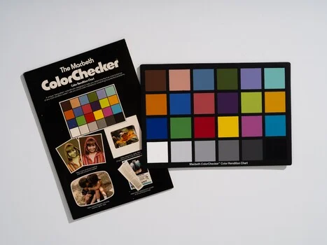
Few technological tools survive a half-century of continuous innovation without fundamental redesign, yet a humble card consisting of 24 painted squares remains an indispensable fixture in professional camera bags worldwide. The ColorChecker, originally introduced to the photographic industry in the summer of 1976, addresses a fundamental limitation that digital sensors and chemical film emulsions have never been able to overcome independently: the objective quantification of color under variable illumination.
As the ColorChecker marks its 50th anniversary, its enduring relevance offers a compelling case study in industrial design, chemical engineering, and the enduring necessity of physical calibration in an increasingly digital universe. From fine art preservation and commercial fashion studios to space exploration initiatives, this small chart continues to dictate the global standard for color fidelity.
The Genesis of a Standard: Summer 1976
The origins of the chart trace back to a collaborative research paper titled "A Color-Rendition Chart," published in the Journal of Applied Photographic Engineering in 1976. Authored by C. S. McCamy, H. Marcus, and J. G. Davidson—researchers working at Macbeth, then a division of Kollmorgen—the paper addressed a persistent chaos within the photographic workflow. Prior to their innovation, photography lacked a portable, universally accepted baseline for color accuracy. Photographers could subjectively describe hues or argue about color balances, but they had no standardized physical reference to place directly within a photographic frame and measure against during post-processing.
The breakthrough engineered by McCamy and his colleagues lay not merely in applying color to cardboard, but in the sophisticated chemistry of the pigments themselves. Each of the 24 patches was meticulously formulated so that its spectral reflectance closely mimicked a real-world class of object. Consequently, when ambient lighting conditions shift, the patches react in precise tandem with natural elements such as human skin, botanical foliage, and open skies.
A pigment that matches human skin exclusively under a single daylight spectrum holds little practical value. However, a pigment that duplicates the precise behavior of skin across daylight, tungsten, and overcast conditions acts as a true color body double. It tricks photographic film and digital image sensors in the exact manner that real-world subjects do. This foundational design choice explains why a calibration tool originally conceived for analog color negative film continues to profile modern mirrorless digital sensors accurately fifty years later.
Anatomy of the Grid: Four Rows, Six Columns, and Strategic Placement
The layout of the ColorChecker is governed by an intentional engineering logic. Arranged in a four-row, six-column matrix, each section serves a distinct calibration purpose.
The top row comprises natural elements: dark skin, light skin, blue sky, foliage, a blue flower, and a bluish-green tone. The second row houses intermediate hues, including vibrant oranges, purples, and yellow-greens. The third row displays primary and secondary colors—red, green, blue, cyan, magenta, and yellow—establishing the crucial tripartite agreement required among camera sensors, display monitors, and printing devices. The final row consists of a balanced grayscale ranging from pure white through intermediate neutral grays to absolute black.
The prominence of human skin tones in the primary positions reflects a deliberate psychological and physiological priority. Human visual perception is exceptionally sensitive to subtle inaccuracies in skin tones, whereas viewers are significantly more forgiving of minor deviations in the rendering of a leaf or a cloud. By prioritizing skin accuracy at the top of the chart, the entire frame is pulled into visual harmony.
For everyday commercial and editorial workflows, however, the most labor-intensive component of the card is the utilitarian grayscale row at the bottom. By capturing a single reference frame featuring the chart at the beginning of a lighting setup, digital technicians can establish precise white balance settings in editing software instantly. This single procedure eliminates hours of tedious slider adjustments.
The Economic and Visual Cost of Color Casts
In professional imaging, minor color imbalances—often imperceptible to the untrained eye—can compromise the integrity of commercial products, artistic portraits, and archival documentation. Understanding the mechanics of color shifts clarifies why physical reference targets remain vital.
When a warm lighting environment is captured using a daylight white balance setting, the resulting image suffers from a distinct amber shift. Saturated reds are pushed toward aggressive oranges, delicate pinks are drained from floral subjects, and human skin acquires a ruddy appearance resembling an unconvincing tan rather than a technical error. Because the image does not appear outright broken, human viewers often mistake the failure for an intentional creative choice.
Green color casts, frequently introduced by fluorescent fixtures, inexpensive LED sources, or ambient light reflected from heavy foliage, present an even greater challenge. Human eyes are notoriously poor at detecting minor green tints in complex scenes. Such casts impart a subtly soiled appearance to white fabrics while stripping warmth from skin tones. Because photographers routinely correct general color temperature while ignoring residual tint, images often remain subtly compromised.
Conversely, unintended blue shifts are readily apparent against neutral backgrounds, yet they frequently tempt editors into severe over-correction. Overcompensating for a blue cast pushes human skin tones instantly into unnatural, saturated oranges.
Evolution, Corporate Lineage, and the Death of the Over-Complex Successor
The market longevity of the 24-patch design is further highlighted by the fate of its attempted replacements. In the year 2000, GretagMacbeth introduced the ColorChecker DC, an expanded target featuring 237 patches across a larger surface area, designed specifically for advanced digital camera profiling. It offered a wider color gamut and high-gloss patches intended for heightened saturation measurements.
Despite its theoretical advantages, the ColorChecker DC was eventually phased out, while the original 24-patch iteration retained its dominance. Industry consensus proved that 24 distinct patches represent the optimal cognitive and practical limit for rapid visual parsing and frame composition. Beyond that threshold, additional data points yielded diminishing returns for practical workflows.
The corporate history surrounding the manufacturing of the chart reflects decades of industrial consolidation. The Macbeth Artificial Daylight Company was founded in 1915, followed by the Munsell Color Company in 1918. Kollmorgen acquired Macbeth in 1965 and Munsell in 1970, uniting light and color science under a single corporate umbrella years before the chart’s debut. Subsequent corporate transitions saw Gretag merge with Macbeth in 1997, followed by acquisitions by X-Rite in 2006, Danaher in 2012, and Calibrite in July 2021, which assumed management of the photo and video portfolio. Throughout these corporate shifts, the physical pigment materials have continuously been produced by the Munsell Color Laboratory.
A crucial technical detail for archivists and long-term practitioners involves a manufacturing transition implemented in November 2014. Driven by evolving safety and environmental regulations, X-Rite reformulated the pigments used in production. While visual appearance remained consistent, the underlying spectral values shifted slightly. Consequently, historical calibration profiles generated with pre-2014 charts are not strictly interchangeable with modern iterations.
Scaling Science: From Postage Stamps to Space Probes
To accommodate diverse photographic applications, the ColorChecker Classic is manufactured in five distinct dimensions, ranging from the ultra-compact "Nano" (measuring 24 by 40 mm, designed for macro photography of coins and jewelry) to the monumental "Mega" (measuring 1016 by 1524 mm, engineered for legibility across open fields or aerial drone deployment).
For specialized scientific and archival applications requiring advanced profiling, the Digital SG model expands the concept to 140 patches, incorporating the original 24 squares, a 17-step grayscale, and 14 dedicated skin-tone variations. Priced significantly higher than the standard Classic, the Digital SG serves laboratory environments and high-end reprographics where custom camera profiling demands maximal data density.
Beyond commercial studios, the chart is heavily relied upon in cultural heritage institutions, museums, and natural history archives, where digital records must achieve quantifiable scientific fidelity rather than mere aesthetic appeal.
Its utility has even extended into aerospace exploration. In June 2008, during pre-flight calibration testing of the Mars Descent Imager (MARDI) for NASA’s Mars Science Laboratory inside the clean rooms of Malin Space Science Systems in San Diego, a ColorChecker was positioned directly within the optical path. While the physical card did not travel to the Martian surface—rovers instead utilize purpose-built radiometric targets adapted to localized dust and atmospheric scatter—the descent camera’s baseline optical characteristics were calibrated against the Munsell standard on Earth.
Fifty Years of Unbroken Relevance
With consumer and professional pricing ranging from approximately $74 for the Mini to $119 for the Passport Photo 2 protective kit, the ColorChecker remains a modest investment for imaging professionals. Industry veterans frequently emphasize that the most effective calibration tool is simply the one a photographer consistently carries into the field, as a high-end reference target left in a studio drawer provides zero practical utility.
The true legacy of the ColorChecker’s golden jubilee lies in its remarkable resistance to obsolescence. As image capture technology evolved from silver-halide chemical emulsions to solid-state digital sensors—with semiconductor architectures advancing rapidly every eighteen months—the physical calibration card remained entirely unchanged. The foundational question it was designed to answer—what color is this, actually?—remains as vital today as it was in the summer of 1976.