

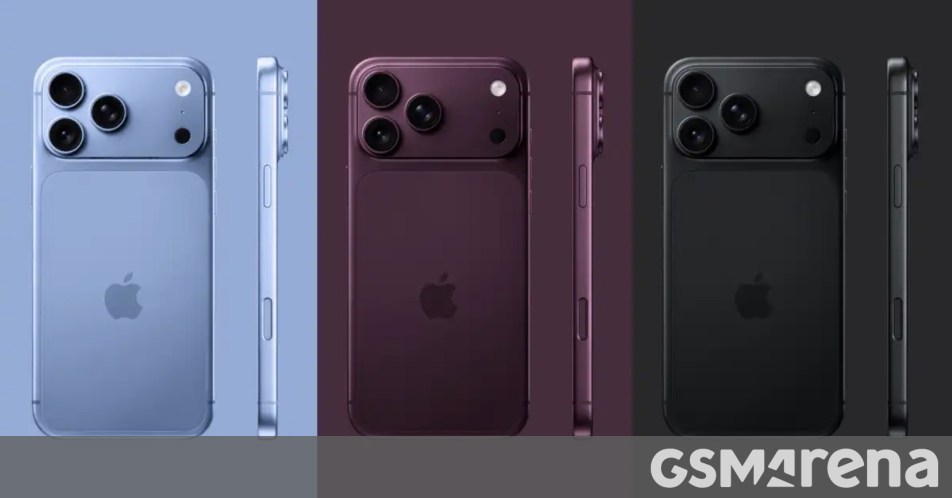
A new report from Macworld claims to have cracked the code as to which colors will be available on the upcoming iPhone 18 Pro series, asserting that the highly anticipated flagship devices will arrive in a meticulously curated selection of four distinct shades. According to "sources familiar with Apple’s supply chain," the iPhone 18 Pro and its larger sibling, the iPhone 18 Pro Max, are internally referenced with the Pantone color codes Light Blue (Pantone 2121), Dark Cherry (Pantone 6076), Dark Gray (Pantone 426C), and Silver (Pantone 427C). This revelation provides an early glimpse into the aesthetic direction Apple is planning for its premium smartphone offering, typically unveiled in the autumn of each year. The choice of colors is a critical aspect of Apple’s product strategy, influencing market appeal, brand perception, and consumer purchasing decisions in the competitive high-end smartphone segment.
Apple’s Strategic Approach to iPhone Pro Colors
Apple’s selection of colors for its iPhone Pro line is rarely arbitrary; it is a carefully calculated decision that balances design innovation with market trends and brand identity. Historically, the Pro series has opted for a more sophisticated, often muted, and premium palette compared to the vibrant and diverse options available for the standard iPhone models. These "hero colors" — a signature shade heavily featured in marketing materials and product launches — serve to differentiate the new generation and often become synonymous with that year’s release. For instance, the iPhone 12 Pro introduced Pacific Blue, the iPhone 13 Pro featured Sierra Blue, the iPhone 14 Pro brought Deep Purple, and the iPhone 15 Pro debuted Natural Titanium. Each of these colors was carefully chosen to evoke a sense of novelty, luxury, and technological advancement. The alleged Dark Cherry for the iPhone 18 Pro is poised to assume this crucial role, signaling a bold yet refined aesthetic shift. The use of specific Pantone references internally underscores the precision with which Apple’s design teams work, ensuring color accuracy across various materials and manufacturing processes before these shades are given consumer-facing marketing names.
The Alleged iPhone 18 Pro Color Palette: A Detailed Examination
The leaked palette offers a mix of classic Apple tones and a striking new "hero" color, each with its own potential implications for design and market appeal.
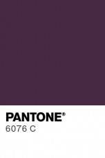
Dark Cherry (Pantone 6076): The New Hero Shade
Emerging as the most significant addition, Dark Cherry is described as a rich, deep "red wine" color. This shade is expected to be the flagship color for the iPhone 18 Pro generation, prominently featured in promotional campaigns and likely to be the most sought-after initial release. This aligns with earlier rumors of a "deep red" color variant for the iPhone 18 Pro, suggesting consistency in supply chain intelligence. The introduction of Dark Cherry marks a departure from the "Cosmic Orange" hue, which served as the hero color for the preceding iPhone 17 Pro series. The shift from a potentially more playful orange to a sophisticated red wine tone could indicate a desire by Apple to reinforce the Pro line’s mature and luxurious appeal. Red, in its deeper iterations, often conveys power, passion, and elegance, resonating with a demographic that values refined aesthetics. The finish of this color will be critical; previous Pro models have utilized a matte glass back combined with polished or brushed metal frames, and a Dark Cherry in such a finish could offer a captivating interplay of light and shadow, enhancing its premium feel. The strategic replacement of Cosmic Orange suggests Apple is continually evaluating the reception of its hero colors, opting for a shade that perhaps offers broader, more enduring appeal within the luxury segment.
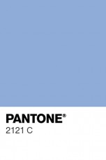
Light Blue (Pantone 2121): A Touch of Serenity
The second new shade, Light Blue, is said to closely resemble the "Mist Blue" color option that was available on the vanilla iPhone 17. The inclusion of a lighter blue tone in the Pro series suggests a continuation of Apple’s recent affinity for blue hues across its product lines. Blue colors, particularly lighter and more muted versions, are often associated with calmness, reliability, and modernity. This Light Blue could offer a refreshing alternative to the darker, more intense blues seen in past Pro models, providing a subtle yet distinct option for consumers. Its resemblance to a standard iPhone 17 color could also indicate a strategic move to bridge the aesthetic gap slightly between the Pro and non-Pro models, offering a familiar and broadly appealing color profile while maintaining the Pro’s superior materials and finishes. This shade might cater to users seeking a less overtly bold color while still desiring a contemporary look for their high-end device.
Dark Gray (Pantone 426C): The Return to True Darkness
Apple is also reportedly bringing back a true dark shade, close to black, which is internally referred to as Dark Gray. This is a significant development for users who have long desired a deeper, more profound dark option than some of the recent iterations like Graphite or Space Gray. While Apple has consistently offered a dark variant in its Pro series, the exact shade often varies, sometimes leaning more towards a very dark silver or a charcoal. A "true dark shade, close to black" fulfills a perennial demand for a classic, understated, and professional aesthetic. Dark colors are perennial favorites in the electronics market due to their timeless elegance, ability to mask minor imperfections, and perceived sophistication. This Dark Gray could offer a sleek, almost monolithic appearance, reinforcing the Pro line’s serious and professional image. Its deep tone would likely complement the high-end materials, such as titanium or stainless steel, expected for the iPhone 18 Pro’s frame.
Silver (Pantone 427C): The Enduring Classic
Lastly, the report indicates the return of a Silver shade, which is said to be identical to the one offered on the iPhone 17 Pro and 17 Pro Max. Silver is a staple in Apple’s premium product lineup, consistently available across various devices due to its timeless appeal and versatility. It conveys a sense of clean modernity, technological sophistication, and premium craftsmanship. Its reflective qualities beautifully highlight the device’s design and materials, making it a perennially popular choice. The consistency of this shade across generations also offers a sense of continuity and brand recognition, catering to consumers who prefer a classic and enduring aesthetic over more trend-driven colors. Its presence ensures that there is always a safe, elegant, and universally appealing option for iPhone Pro buyers.
Chronology of Leaks and Apple’s Product Development Cycle
The emergence of color information so far in advance of the typical September iPhone launch underscores the intricate and lengthy product development cycle at Apple. Design decisions, including color palettes, are finalized many months, often over a year, before a product reaches consumers. This extensive lead time is necessary to allow for material sourcing, manufacturing process optimization, and large-scale production across Apple’s vast global supply chain. Leaks of this nature, often originating from "sources familiar with Apple’s supply chain," are a common phenomenon in the tech industry. They typically occur as various component manufacturers, assembly partners, and logistics providers begin to receive specifications and production schedules. While Apple maintains extreme secrecy, the sheer number of entities involved in bringing a new iPhone to market makes absolute containment of information nearly impossible. Historically, early leaks regarding colors, design elements, and key features have often proven accurate, providing a reliable barometer for upcoming Apple products. This report, published well ahead of any official announcements, falls within the typical timeline for such detailed product specifications to begin circulating within industry circles.
Supporting Data: The Psychology and Market Impact of Color
Color is a powerful psychological tool in consumer electronics, influencing perception, desire, and ultimately, sales. Studies consistently show that color is a significant factor in purchasing decisions, especially for personal devices like smartphones that double as fashion statements. For premium devices like the iPhone Pro, color choices contribute to the perceived value and luxury status. A "hero color" can generate buzz and often commands a higher initial demand.
Market trends also play a crucial role. While other manufacturers might experiment with gradient finishes, iridescent effects, or highly saturated tones, Apple’s Pro line typically leans into more solid, sophisticated colors that emphasize the device’s material quality and industrial design. The move to Dark Cherry could be seen as Apple responding to a broader consumer desire for richer, more mature color options, perhaps moving away from brighter or more experimental tones that might have a shorter lifespan in terms of appeal. The sustained demand for classic shades like Silver and Dark Gray also validates Apple’s strategy of providing timeless options alongside novel ones. The interplay between the chosen color and the device’s material — be it aerospace-grade titanium, surgical-grade stainless steel, or matte glass — is paramount, as the material’s finish and texture significantly alter how a color is perceived.
Statements and Inferred Reactions
As is customary, Apple Inc. maintains a strict policy of silence regarding rumors and unreleased products. No official statement is expected from the company regarding these alleged color options until the official product launch event, typically held in September. This long-standing practice is part of Apple’s strategy to control the narrative and build maximum anticipation for its keynotes.

However, industry analysts might offer insights into these potential choices. For example, a hypothetical analyst might comment, "The rumored color palette for the iPhone 18 Pro series, particularly the introduction of Dark Cherry, suggests Apple is continuing its strategy of balancing classic, universally appealing shades with a compelling new ‘hero’ color each year. This approach allows them to cater to a broad market while simultaneously generating excitement and a sense of novelty around the latest flagship. The shift from Cosmic Orange to a deeper red wine tone could indicate a refinement in their premium aesthetic, aiming for an even more luxurious and enduring appeal." Furthermore, third-party accessory manufacturers, who closely monitor such leaks, would likely be moving swiftly to incorporate these anticipated colors into their product development cycles for cases, skins, and other accessories, ensuring they are ready to meet market demand once the official announcement is made. The precision of Pantone references is invaluable to these manufacturers for color matching.
Broader Impact and Implications
The early leak of color options has several broader implications beyond mere aesthetic anticipation. For consumers, it fuels excitement and allows potential buyers to begin conceptualizing their next iPhone purchase, often leading to pre-purchase discussions and heightened brand engagement. For the broader smartphone industry, Apple’s color choices often set trends. If Dark Cherry proves popular, it might influence competitors to explore similar rich, deep red tones in their future flagship offerings.
The specific Pantone references also highlight the meticulous attention to detail in Apple’s design and manufacturing processes. Ensuring color consistency across millions of units produced by multiple suppliers is a complex logistical and technical challenge. The information also offers a subtle glimpse into Apple’s ongoing design philosophy, suggesting a continued emphasis on sophistication and understated elegance for its Pro line, with the "hero" color providing the main point of visual distinction. While the core industrial design of the iPhone Pro series has seen iterative refinements in recent years, color remains one of the most immediate and impactful ways Apple introduces novelty and freshness to its annual refresh cycle.
Concluding Caveats
It is crucial to reiterate that despite the specificity of the Pantone references and the credibility of the reporting source, these details remain unconfirmed rumors until an official announcement from Apple. While supply chain leaks have historically proven accurate for various Apple products, final color names, subtle shades, and even the availability of certain options can sometimes shift closer to launch. Manufacturing processes can also lead to slight variations in the final appearance of colors compared to initial renders or internal specifications. Consumers are advised to view this information as an insightful preview rather than a definitive confirmation of the iPhone 18 Pro series’ final color lineup. Nonetheless, the Macworld report offers a compelling and detailed look into what could be the aesthetic foundation of Apple’s next-generation flagship smartphone.

